Welcome!

This is my place to share my creative bits and pieces. My art has no rules, no limits and absolutely no order. My projects change with my moods but for the last few years, my main focus has been paper art. Cards, collage, mixed media and as many techniques as I can get to. My inspiration comes from everywhere.

I hope you enjoy your visit.


Thursday, May 26, 2011

PRETTY PAPERS

The summer mini catalogue is packed with beautiful things and this designer paper is no exception. It's gorgeous and while I don't often use designer paper on my cards, I will use these- a lot! It's called Beyond the Garden and matches the Fabulous Florets stamp set perfectly.

With the dull days we're having, it's nice to see some brightness.

Have a fantastic day!

Wednesday, May 25, 2011

INSPIRED BY MAILE BELLES

I recently picked up the new Papercrafts Card Creations Vol. 9 magazine. It is packed with tons of inspiration and today I'm sharing what inspired me. It's May 25th so that means a Christmas card and I spotted this pretty one- Joy to You & Yours by Maile Belles. Clean design with subtle colours. Here's mine-
A little different but you can clearly see where I started from. Not sure if you can see the base cardstock but it is inked with the matching so saffron applied with scrunched up waxed paper. Very subtle. I boo-boo'd the branch- the one I have is way too short so added the embossed and matted strip instead. I was happy with it and it also gave me a hiding place for the ends of the linen thread and the tape I stuck it on with. Proof again that mistakes are opportunites.  :)

This was quick, all the thinking had already been done for me. Believe it or not, I don't always want to start from scratch. Really, really.
I hope you make a lot of creative choices today and take time to play!

Tuesday, May 24, 2011

OLD & BLUE, NO BORROWED OR NEW

I made this card about three years ago- and that's guessing. It may have been more. Even so, I like the layout of it and the faux charm technique is always fun. For this one, a square of double-sided foam tape was covered in silver embossing powder and melted, about three times. A stamp with Versamark ink on it was pressed into the molten embossing powder and held there for about ten seconds. Once the stamp is removed, the square has a nice image stamped into it, loosely resembling a silver charm.

You can do this without foam tape by applying layers of embossing powder to chipboard. Ink the sides with Versamark and emboss before embossing top. It looks nicer once it's finished if the sides match the top in colour.

Give it a try. Oh, and if you have copper embossing powder, you will love it!
Here's a sample...
That's all for now- thanks for looking!

Thursday, May 19, 2011

TULIPS & SCOOTERS......WORKS FOR ME!

On a warm, beautiful day like today, this would be pure bliss. A relaxed toodle around on a scooter with a basket filled with tulips....perfect stress buster! Even better with a friend.

The scooter has been watercoloured using an acrylic block for a palette and markers scribbled onto it for the ink. I just picked up some ink on my aquapainter and coloured away. So easy and a very relaxing thing to do. The top piece of cardstock has been embossed with tulips.
Oh, and did you notice? The headlight on the scooter is bling!
Remember that you can click on the photo to see it a bit larger.

Enjoy your day and thanks for looking.


Sunday, May 15, 2011

PUNCHES, FOLDERS & DIES.......OH MY!

The only ink on this card is the stamped sentiment, background and some sponged ink on the flower petals. The rest of it is embossed, die cut and punched pieces.
A great way to use up scrap pieces and put together a card fairly quickly.

Thank you for your comments and interest in my little blog. While I don't require them to keep me blogging, I really enjoy your remarks.

Hope you find some creative time today.

Saturday, May 14, 2011

LET'S TRY.......A TUTORIAL!


A very good friend wanted to know how to do Shimmer Watercolor, so I thought I would try to do a tutorial. This could work well or be a total flop but you are all my guinea pigs today so here we go......

Use a dye ink to sponge on colour. I chose to apply it diagonally this time but it can be straight across stripes, blocks of colour, whatever you choose.

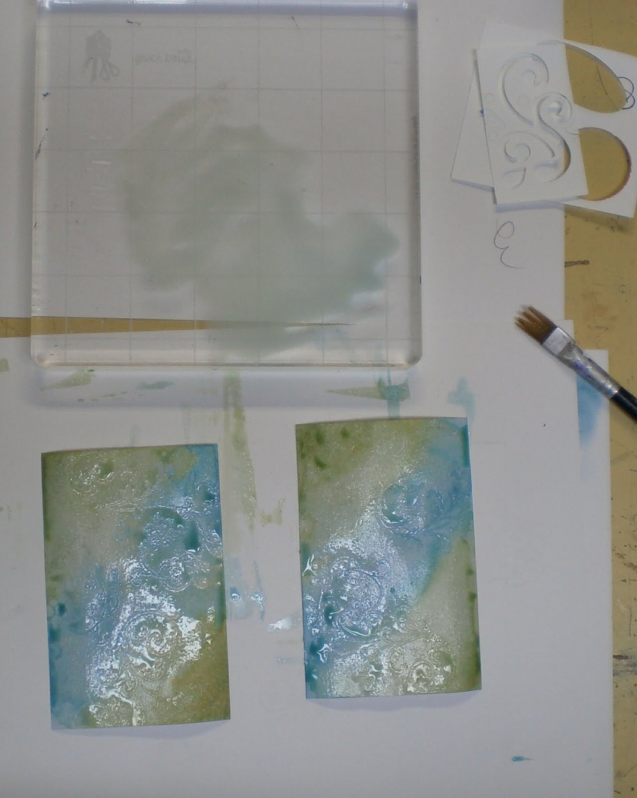
Once inks have dried thoroughly, use your heat gun if you like, clear emboss using a stamp of your choice, Versamark ink and clear embossing powder. 

To create the shimmer watercolour, add a couple drops of champagne ink to a puddle of water. Stir it up and add a drop of blue ink to the puddle. Mix it in and paint it over the blue section you sponged earlier. You don't need to be neat and tidy with this, just get it on the cardstock. Then mix a drop of green ink into the champagne puddle and brush it onto the cardstock.


You can dab away larger drops or just let them dry. Once dry, wipe over the clear embossed areas with a damp cloth. This removes ink from the image for better contrast. This is a subtle colour pairing and your results will be different with every chage in colour.

I wanted the pieces to be a little darker so I did the puddle and ink again. On this card, I added more shimmer ink to punch up the shine. You have lots of choices with this technique.
This technique is very experimental and you can create some amazing backgrounds. 
 I hope you try it using what you have for colour and shine.

With the second piece, I decided to overstamp with a darker ink and again wiped away any excess on the embossing.

Whew! Done!
IF I do another I must remember to take way more photos.

Have a great weekend!

Friday, May 13, 2011

TWISTED EASEL TWO-FER

Why a two-fer? Two techniques!
One technique is the twisted easel design itself and the other technique is the spotlight embossing. Each technique is a variation of a previous one. How so?
Twisted easel is a variation on easel cards. Instead of scoring the cardstock straight across, you score it at an angle. Spotlight Embossing is a variation on Spotlighting, where the embossed design is matched up on the top layer, instead of matching a stamp design. If you've done either technique, hopefully it makes sense to you.  :)
Great fun- give them a try!

Wednesday, May 11, 2011

TULIPS & ....YES, SPRING!

I see a theme these days- bright and usually some flowers.
This card uses retired designer paper and some watercolouring on the stamped image. I wanted a couple cards for a little gift today for my massage therapist. She is awesome! This is the other one I made for her.
She liked them and that made me happy too.

Thanks for visiting!

Tuesday, May 10, 2011

MORE SPRING FLING

The designer paper does the work with this one. It's just right for a soft, pretty card. I don't work with print papers much but when I do I like how the colour decisions are made for me. Easy peasy! Colour combining has always been my weak point so I use whatever tools are available to help me. Colour wheels, designer paper and catalogues -all kinds- are great tools for this.

Have a great day!


Monday, May 9, 2011

LOOKS LIKE SPRING

How about a little bit of lattice for your spring flowers? I really like the lightness and freshness of this card. Mostly die-cuts used here with a little Smooch ink for the gold flower centers. The card is easy peasy but the assembly takes a bit of time. I'll definitely make a lattice card again.

Thanks for looking and I hope you can create today AND enjoy some sunshine.

Sunday, May 8, 2011

A CARD & A COMMENT

Her birthday was a week ago so I can show you the card I made for my good friend M. Some tearing, embossing, watercolouring then add some ribbon and bling. Hand delivered to keep it safe and it was a happy birthday.

I wanted to share this little "find" with you. Sometimes, a little thing can make you smile when you least expect it. This is just such a thing......
....are you smiling? I think it's great advice too-
BE AWESOME
...love it!